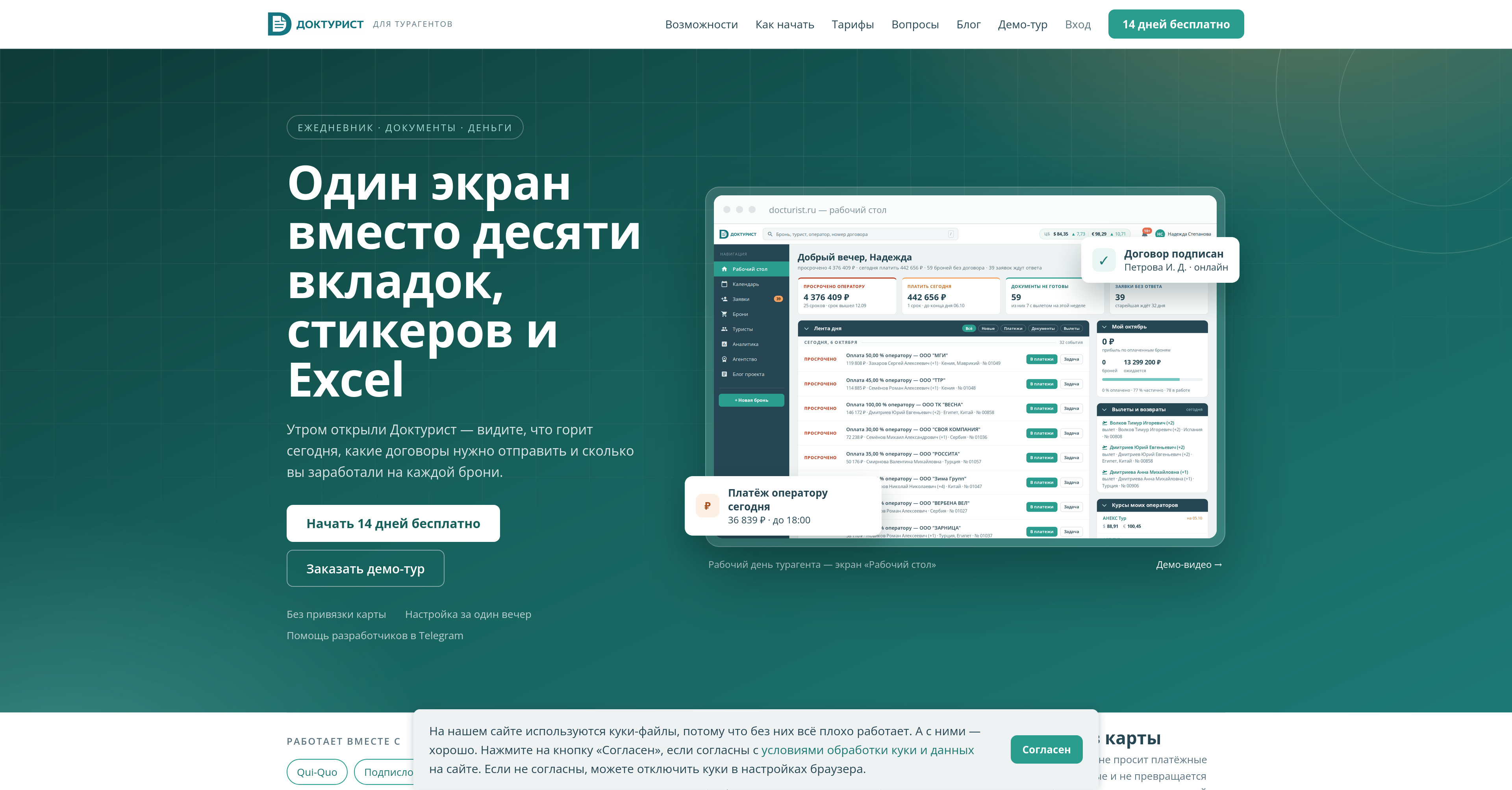
The other day a PR of 610 files was finally defeated and merged! The result is a complete redesign of Docturist. The public part (the landing page and the blog) got a bit of it too, but first of all it is the whole inside: all the pages, forms and dialogs of the CRM itself.
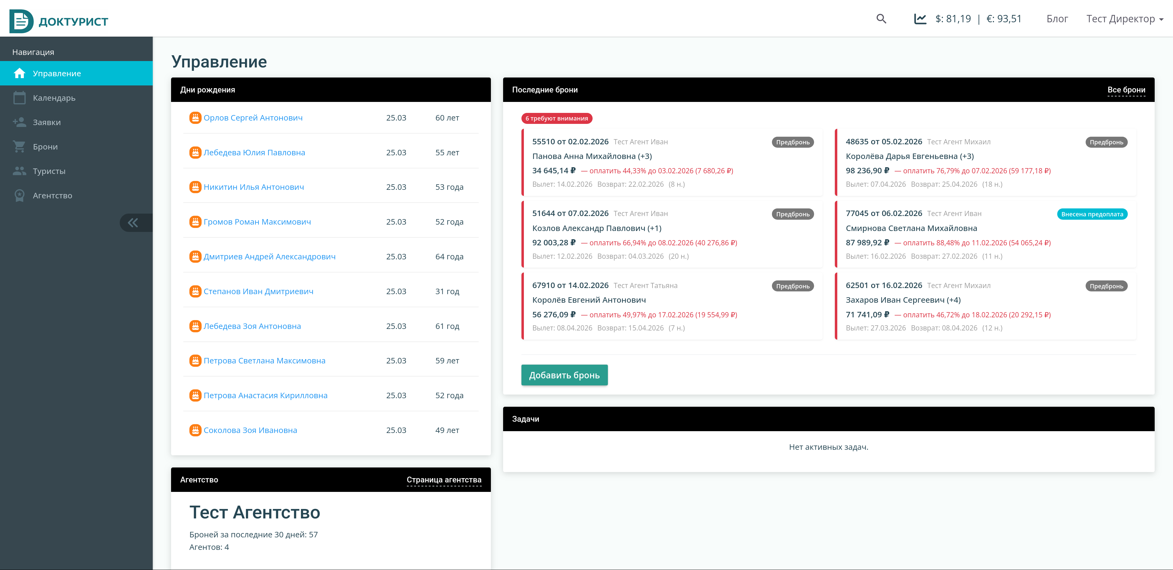
This is one more example of how you can get carried away solving tasks with a neural network. Initially the idea was much more modest. The dashboard, also known as the desktop, also known as the home page inside the system, was made rather simple. This is what it looked like:
Of course, the travel agents reported that they did not use the widgets on this desktop at all. Only the links, to jump straight to the section they need. And I wanted it to be rather a quick access to important sections and information. So that some things could be done without leaving the dashboard at all.
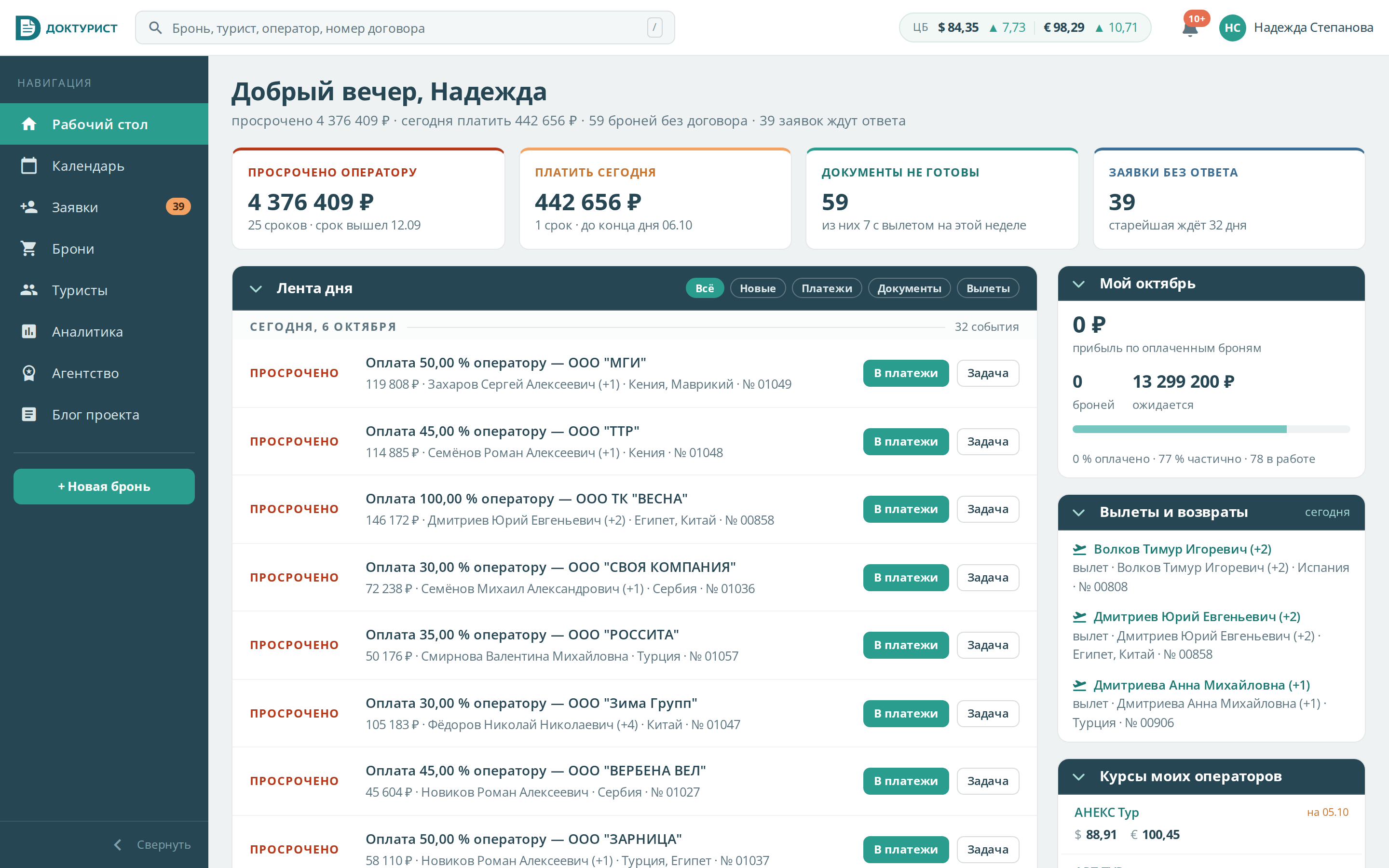
That is what Claude Design and I took on. We rethought the contents of the dashboard to make it convenient and actually used, not just a place for links like the desktop in Win95. And the «before» above turned into a new «after»:
Now there are all kinds of metrics, and most importantly a smarter bookings feed. You can look at the latest bookings by date, or at the ones that need particular attention.
I did not hold back Claude's design impulses, so on top of that I got a new style at once. The previous style was built on the Color Admin theme, which I bought specially back in 2018. The theme has of course aged somewhat since then and lost some of its relevance.
Anyway, once there is a new look, you do not want to leave the other pages in the old one. And so, page by page, component by component, first with Claude Design and then with Claude Code, we brought the whole service to the new styles. And since just redrawing things is boring, we also rethought, improved and remade the components on the pages along the way.
That is how we got a PR of 610 files. Which of course wore me out with reviewing and testing. In the nutshell, the points of my talk (in Russian) on this topic still hold. You have to test, structure, decompose. But not looking at the generated code, as Robert Martin advises, does not work out for me just yet: I checked every screen, inspected the changes, the tests, the front end, and in each part I found something that was not done quite right, or did not work, or caused some new problems.
But in the end I checked everything, tried it by hand and shipped it. So now Docturist has not only a new, rethought, modern design, but also all kinds of usability bits, including:
— Docturist remembers and shows right away the set of tour operators the agent works with most often, no need to search through autocomplete every time.
— / or Ctrl+F immediately starts a search across all data (pressing Ctrl+F again starts the browser's native search).
— Booking documents can be generated and signed right from a popup on the desktop, without having to open the booking.
— The calendar works better on mobile devices (the mobile calendar is simply made anew).
— The profile page is finally split into 5 sections by the topics of the settings.
I am happy with the result, and now updates can be rolled out more often again, without reviewing such huge PRs. Overall the redesign took about a month and a half. Next up are the integration with an online cash register service (already done) and a dark theme (also done). Let's go!
Docturist, a smart planner for travel agents